Showing posts with label design. Show all posts

Tuesday, December 9, 2008

Stuff I Like

1) The Myers Motors new NMG (No More Gas) electric car. I also like their vision for the future:

Sub-$20,000 vehicles that are practical and affordable is the vision of Myers Motors. This vision of affordable, highway speed, electric vehicles, one for every two car garage, can be met today with just a little bit of help. Te help needed is that Myers Motors needs to retool from low volume production to high volume production … and your “vote” will help that process. The help needed is also for you to make your wishes known to your elected officials that you want Middle Class Americans the same access to the $7500 electric vehicle tax credit that the rich and famous now get but that is not available to most of us because we can’t afford a $100,000+ electric sports car. What to ask for: That seven words, “and which has at least 4 wheels” be removed from the IRS definition of a motor vehicle so that all legal, highway speed, vehicles are eligible for this up to $7500 tax credit, greatly helping bring sub-$20,000 electric, highway speed vehicle to the world’s drivers.
We would love to sell you an NmG today, but we know that they cost too much to meet most people’s financial needs today. We are working to bring you practical, affordable, highway speed electric vehicles and our next step is to reduce the purchase price of our No more Gas electric vehicle … and to do it using US technology and US labor to create US jobs that put US citizens for work for products that are sold in the US. Creating additional vehicles to meet other market needs is another step. Coming December 18th, we will be revealing where we are with one of those steps. We hope to see you then.


2) Radical Cross Stitch and the Craft Cartel
I love the quote from the Radical Cross Stitch site:
"I don't regard myself as an artist. I am a craftsman. Fuck art." - Clifford Harper


3) New cupcake transport packaging posted on the Design Packaging site. So smart, and well designed.

Thursday, December 4, 2008

The Coffee And Tea Wrecks


I am loving this teabag design posted on The Dieline. Such a great, creative, eye-catching design that works perfectly with the company's image and branding.

Wednesday, October 15, 2008

lovely 2009 calendar by Orange Beautiful


I love this new calendar! The best feature, aside from the gorgeous typography, is the perforation at the bottom allowing you to re-use it year after year. I could see all twelve months grouped on the wall in frames painted all in the same color. And it's only $28, on pre-order now. Such a fantastic gift idea (hint).

Tuesday, July 15, 2008

Second Intermission

A few things to mention today....

On the way to work I heard a very interesting discussion about a Vermeer forger named Hans Van Meegeren on Think (KERA 90.1). Forgery was not something that was covered in any of my Art History classes, and it was fascinating to learn about different aspects of it, and about the Van Meegeren story. He was a Dutchman, selling Johannes Vermeer forgeries to major museums during WWII and to Hitler and the Nazi party. He was arrested on charges of treason, but the paintings were so good that no one suspected forgery. The Dutch officials were horrified that he had sold the nation's beloved Vermeer masterpieces to the German opposition. Now he was in quite the pickle...if he was found guilty of treason he would be killed, but the only other option was confessing to forgery. He chose, of course, the latter. But when he told official that these were forgeries, not authentic Vermeers, he was laughed at. The officials began to wonder if he was telling the truth, and one of them came up with the idea of giving him a canvas and paints in his jail cell and making him "paint for his life." (I just love that phrase.) This was all researched for the book The Forger's Spell: A True Story of Vermeer, Nazis, and the Greatest Art Hoax of the Twentieth Century (Harper Collins, 2008), written by Edward Dolnick. Library, here I come!


This post on the Wooster Collective cracked me up, especially given my Olympics Logo post from June 2007.


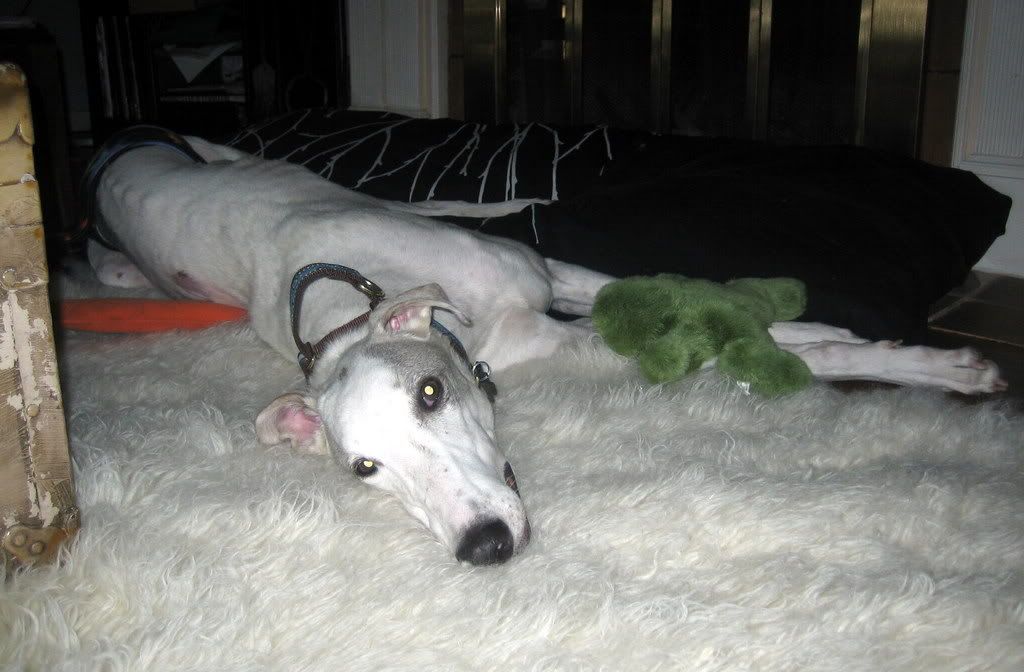
Finally, several friends and I were recently chatting about our least favorite fonts. Among the top hated fonts were (no surprise here), Mistral, Cat Scratch, and Comic Sans. I was searching online today for information on retinal degeneration (yesterday my greyhound Clive was diagnosed with having this), and this article, written entirely in Comic Sans, came up in my search. I have no idea if it even has any good information in it, because between the offensive font and the busy paw prints in the background, my eyes can't focus on it. Why do people love to abuse this font? Ugh. Two paws down!

Friday, October 5, 2007

The Ocean Blue

This is what I have been working on ALL WEEK! Of course, it looks better in HD and has to be a much lower quality to post online.

So, what do you think?

Sunday, June 10, 2007

logo oh no


It seems there is some serious (and well-deserved) controversy over the recently approved logo for the 2012 Olympics in London. It has even made the front of a gossip mag with the headline "Olympics Logo Triggers Epilepsy" (this headline referenced the animated version of the logo). An online petition has even been started demanding its immediate withdrawal. It harks a bit of Keith Haring in my opinion, but not necessarily in a good way. I can't imagine how hideous it will be on all that merch they'll be selling...just picture it embroidered on hats and sweatshirts and printed on everything from pencils to pins to thermal mugs. Ouch...that's a headache.